Reduce Use of Pop-Ups
Pop-ups have their uses, but they can be annoying to users if they have to deal with dozens of them the entire time they’re exploring your site. Since constant annoyance = bad user experience, make sure you keep your use of pop-ups to a minimum if you want better UX for your visitors. It would also be great if the pop-up you’re going to use is a well-designed one that is relevant to your users and carries an attractive offer. Refrain from introducing pop-ups at the very moment visitors enter as well.
Boost Page Speed
With users these days expecting web pages to load in three seconds or less, you need to do whatever you can to make your page speed hit that mark. Failure to do so will likely make them leave your site in favor of another. Some of the things you can do to improve page speed include:
- Optimizing images
- Deactivating non-essential plugins
- Minimizing the use of custom fonts and heavy graphics
- Minifying CSS, JavaScript, and HTML
Provide Ample White Space
Visitors are going to spend much of their time on your website reading your written content. You can make their reading easier and more pleasant by using a lot of white space. Walls of text turn people off and discourage them from reading, no matter how well-written a given post is. White spaces help you avoid those walls of text by giving your words plenty of breathing room. With the improved readability due to ample use of white space, visitors will have a much better user experience while taking in your content.
Ensure Consistency Across Web Pages
As much as possible, make sure that you use the same typeface, color, spacing, headings size, illustrations, and photo choices across all the pages of your website. In short, all your web design choices should follow a theme to ensure consistency and coherence across all pages. It would be odd for a user to move from one page to another and realize that your web design changes radically from page to page. Soon enough, confusion will set in and ruin the user experience for them.
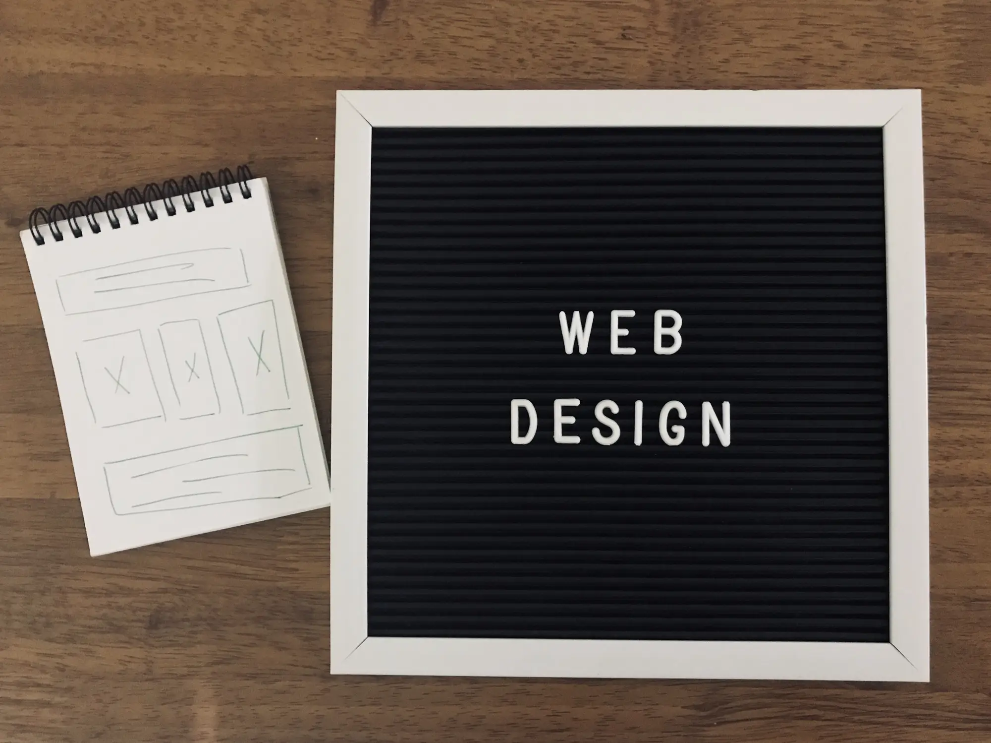
Stick To A Clean Web Design
Web design that uses animations, flashy colors, and whimsical visual elements is fine, but between them and a simple, minimalist, and clean web design, most people will likely go for the latter. If your website won’t lose its essence if you remove visual elements that border on the unnecessary, you would do well to take them down. A clean and straightforward web design tends to lean more towards a better user experience, after all. You can do these web design tweaks yourself or work with a dependable web design company. Either way, you should be able to make your visitors feel great about exploring your site. About the Guest Author Gabby Klesser is the Outreach Manager for LA Website Design, a digital marketing agency that has assembled a team of expert web designers and digital marketing strategists. She often writes about web design, UX, social media, technology, marketing, and starting a non-profit.